Hi, I'm Peter
I'm a Columbia, SC based front-end/UI developer focused on creating user-friendly interactive mobile-first websites that will drive user engagement.
Since graduating with a B.A. in Media Arts from the University of South Carolina in 2009, I have harnessed a passion for front-end web technologies. I am currently working as a front-end/UI developer at UofSC, where my interest in development and design merged. I love making a designer's mockup come to life by translating it into CSS, interaction, and animation to create an engaging user experience. Being primarily self-taught, I am driven, inherently curious, constantly learning, and thrive off of collaboration to make the final product stand out.
Outside of work, you will find me listening to records with my lovely wife (Mollie), making my one-year-old son (Oscar) laugh, going on walks with our dog (Maggie) and trying not to get in our cat's (Mr. Phoebe) way. If you want to know more about me, just ask.
Resumesc.edu
AAF of the Midlands Silver Addy Award - Websites, Consumer — Services
CASE District III Special Merit Award - Total Website Design and Organization
Project
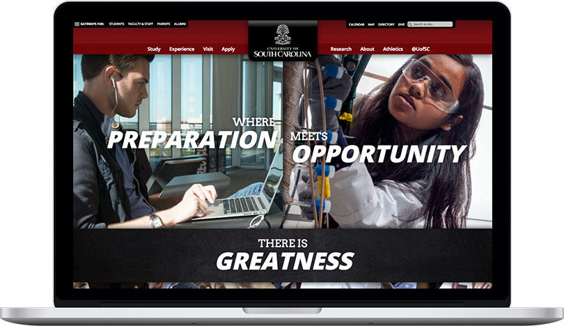
Prior to this project, the University of South Carolina had exhibited a non-responsive and bland website with poor navigation. This was a complete redesign and redevelopment of the University of South Carolina's web presence. Our main goal was to reorganize the site structure to align with our primary audience, prospective students. We also wanted to give it a more modern look along with a responsive design to make it user-friendly on mobile devices. Our team was also responsible for transitioning into a new content management system by creating several new page templates.
My Role
Being the sole front-end/UI developer, my role was to build all new page templates by working closely with our UI/UX designer. At the time, we used the grid framework Foundation to lay out the site. I then used a modular approach to create components that can be reused throughout the site in different combinations. This allowed for more flexibility as needs for different page structures were constantly changing and being added. I also worked closely with our back-end developers and third-party vendors to implement the University's site search, calendar, and map.
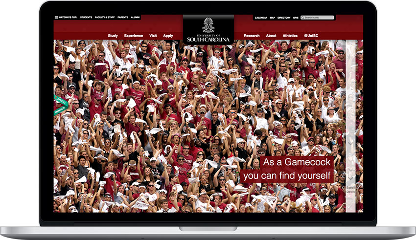
Find Yourself
Awwwards.com Honorable Mention
Project
This was our first ever immersive interactive homepage that we did after the launch of the new sc.edu. We would do something like this every couple months to capture what it would be like to be a student on campus. We wanted to create levels of interactive for these types of homepages. The user could just look at it and get the message or they could dive deeper and scroll to get a fuller experience.
My Role
As the sole developer, I built this using a scrolling parallax library that would give me more control over the various layers that needed to animate while scrolling. This was incredibly fun and challenging to work on as I had not done something like this before. The biggest challenge would have to be the performance to make sure there would be as minimal animation stuttering as possible to keep up with the refresh rate. Since there was such a concern for performance, this is best viewed on a tablet in landscape mode and desktops to get the full experience.
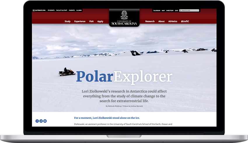
Polar Explorer
Project
This was the first of many online news stories where we abandoned the traditional news story template to create an engrossing experience for the reader. This particular story was about a faculty member's trip to Antarctica. While she was there she was able to capture her research with some outstanding video and photography.
My Role
I collaborated and worked alongside our sole designer to make sure that her vision for the story was seen through. I built an entirely new template that would take advantage of a full-width design that accompanied auto-playing (no audio) background videos.
Time Flies
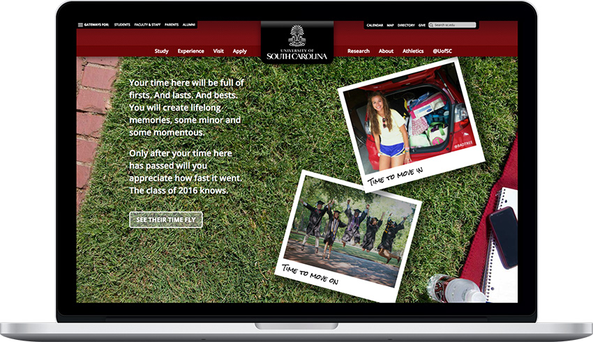
Project
For every May commencement, the University of South Carolina would align the homepage with an experimental and creative interactive experience that would highlight the last four years. That year, the idea was to give the user the feeling of time flying by having polaroid photos being dropped on the screen faster and faster. Once again, this homepage worked on multiple levels. If the user only looked at the page they got the overall message. The user could then click on the button that would trigger all the photos flying in. Once completed, the user could then drag all the photos around the page to see every photo if they wanted.
My Role
Being the sole developer on the team, my task was to build out this concept while also making sure the idea met our deliberate intention and to give insight on what was feasible. Since I had just come back from a conference where I had learned more in-depth about the Greensock Animation Platform (GSAP), I decided to go with that as my tool to build out the photo animations. The results were met with excellent feedback since it not only appealed to our main audience, prospective students by showing what it would be like to be on campus, but alumni and current students as well.
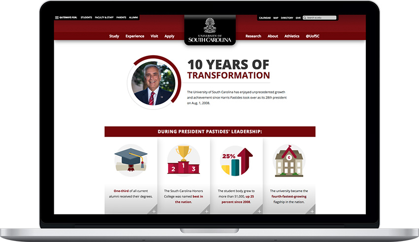
10 Years of Transformation
Project
To coincide with the University of South Carolina's President's 10 year anniversary, our team was tasked with creating an online representation of an infographic that was designed in-house. It needed to showcase all of the President's milestones throughout his tenure along with being an interactive experience for the user.
My Role
Once again, I reached for GSAP since we were wanting to animate the SVG illustrations on hover. I almost always reach for GSAP when it comes to timeline or SVG animation. It is so easy to work with and has a huge emphasis on performance. I worked very closely with the print designer who illustrated the infographic to come up with animations that would draw the user into clicking on each milestone. Since there was going to be additional content for each milestone, I decided to go with placing it in a lightbox/modal that would allow for larger amounts of text.